How Color Theory Completely Changes The Way Spaces Feel
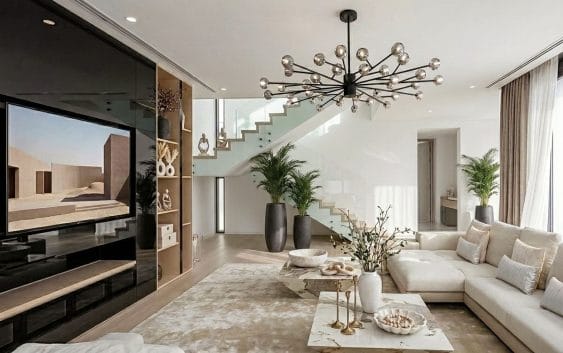
The same room can feel completely different without moving a single piece of furniture. Change the wall color, introduce a broader accent, or soften the palette, and suddenly the space can appear larger, warmer, brighter, or more dramatic. That shift is exactly why color theory deserves a central place in interior design.
Colors across walls, furniture, fabrics, and finishes shape how the entire space is perceived, creating a specific mood while bringing the overall design together.
The psychology behind colors
Every color communicates a different emotion. Blue encourages calmness, while yellow adds warmth and optimism to kitchens and creative spaces. Green connects interiors with nature and supports a relaxed atmosphere. Red introduces intensity and energy, while purple adds depth and sophistication. Designers select shades based on each room’s purpose and the mood residents want to create.
Warm and cool shades set the mood
Warm colors such as red, orange, and yellow make rooms appear lively and inviting. They suit dining areas, social lounges, and spaces where conversation takes centre stage. Cool colors such as blue, green, and violet offer a quieter atmosphere. They work well in bedrooms, study rooms, and private retreats. Designers balance both groups to establish visual comfort and maintain a consistent mood throughout the home.
Light changes how colors appear
Natural and artificial lighting affect how every shade appears. Sunlight reveals undertones that dim lighting may conceal, while warm bulbs add a golden cast to walls and furnishings. Dark colors absorb more light and introduce intimacy, while pale shades reflect light. Designers test paint samples at different times of day to see how changing light affects the final palette.
Color creates visual balance
A balanced palette connects walls, furniture, flooring, and decorative details. Designers usually select a dominant shade, a secondary color, and a smaller accent tone to maintain harmony. Neutral backgrounds allow colourful furniture or artwork to stand out without overwhelming the room. Contrasting shades highlight architectural features, while related tones establish a gentle flow between adjoining spaces. This approach gives each room individuality while preserving a unified interior.
Personal taste guides color choices
Color preferences reflect personality, culture, memories, and lifestyle. Some residents prefer earthy browns and muted greens, while others enjoy jewel tones and striking contrasts. Designers discuss these preferences before selecting materials, fabrics, and finishes. They also consider room size, existing furniture, and practical maintenance. A personalised palette supports comfort and gives each space a distinctive identity without sacrificing function or visual appeal.